TERM 1
FLYER AD
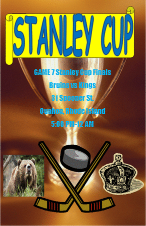
The project that i was assigned to do was create a flyer ad using Microsoft publisher. I was also assigned to focus on using line, color, emphasis and balance. The input factors in this project would be needing to know how to use publisher, word art, and clip art. Also understanding line, color, emphasis, and balance. The way i started this project was to do a flyer ad about a Stanley Cup party. I first found a trophy background using clip art. I then used word art and created simple lettering using the words Stanley Cup in blue. I then found a script banner and placed it behind the lettering in yellow. I then typed out an address and time and then found some more clip art that would go along with the text relating to hockey. The final output of my ad was a large trophy for the background with a script in yellow behind blue lettering of the words Stanley Cup. I also put text saying the party was at 31 Spooner Street in Quahog, Rhode Island. The clip art I used was a bear representing the Boston Bruins, a crown representing the LA Kings, hockey sticks, and a puck. Some feedback I was given by my teacher was to change the font color from red to blue because the red didn't blend well with the background. Also, I gave myself feedback on positioning the puck in between the hockey sticks because I felt it balanced the ad more. I also decided to place the bear and crown on opposite sides because I felt it balanced the ad as well. One thing i learned how to do during the project was how to use Microsoft Publisher, I had never used it before so it was definitely something i needed to learn how to use. Another thing I learned during this project was how to use clip, again it was something I had never used before. If I could do this project again I would use pictures from the internet instead of clip art because it would probably be better looking then simple pictures off of clip art.
| graphics_quiz.pub |
Brochure
|
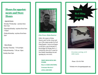
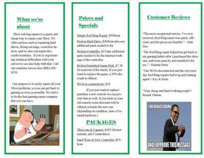
This brochure project that was assigned was to create a brochure as if we owned our own business. We used our own selfie as an owner and edited in photo-shop. Then we filled in information pertaining to our business.
|
Term 2
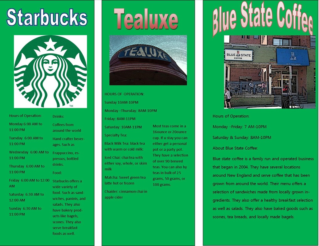
Thayer Street Brochure
Dylan Saraiva 11/6/2014 We had to construct a tri-fold brochure about cafes on Thayer Street in Providence, Rhode Island. A field trip was taken to Thayer Street to walk around and discover information about the cafes. This would help us to make the brochures, which included pictures, about the several different cafes that are located on Thayer Street. The needs we had for our tri-fold brochures were being assigned the service that we were going to be looking for on Thayer Street. We also needed to be assigned our groups for who we would be walking around with when we were collecting our information. We needed to take the field trip to Thayer Street as well as bring our phones to take pictures of the businesses on Thayer Street. We also needed Microsoft Publisher and the computers in the graphics room when we returned to make the brochures. The final thing we needed was the folding machine to fold our brochures. The first thing we did with this project was being assigned with our groups and taking the field trip to Thayer Street and collecting information on the cafes. We returned from the field trip and talked in our groups about how to set up our brochures. We opened up Microsoft Publisher and used a landscape file and started to design the brochure itself. We used Adobe Photoshop to edit our pictures that we had taken so that the pictures were ours. The information was filled in on the cafes about the hours and what types of food and beverages that they offered. The project was then saved and placed onto our Weebly websites. The final output was green brochure about “Thayer Street Cafes” with a sign of Thayer Street and a picture going down onto Thayer Street. There’s a map of Thayer Street on the back of the brochure with little pin points of all the local services on the street. The cafes listed on the brochure are Tealuxe, Blue State Coffee, Starbucks, and Au Bon Pain. All these cafes are described with their hours of operation and a brief description of their menu. I was given different types of feedback during this assignment. One piece of was given from someone in my group was to edit the pictures more in Photoshop instead of just cropping them down. A piece of feedback I gave myself was fixing the type of word art I had used on the front cover of my brochure. I used a green background and at first tried using a piece of blue word art, but once it was placed down the text appeared to be fuzzy, so I switched out the blue piece of word art for a red one that highlighted the text clearer. During this assignment I learned different tools but especially I learned different tools in Photoshop. One new tool I learned how to do is how to filter photos. This was helpful to use in editing the pictures that were taken and making them look like a mosaic tile or looking it was drawn with charcoal. Another tool used during this project was the cloning tool and how to put a piece of one photo onto another photo. This helped me learn how to edit a photo and not make it look like the original photograph. If I was to do this project again I think I might try and use different filters on the photos that I used in the brochure. I would try and edit them with different filters because I could possibly make it look even better than it did the first time I tried. This could make the brochure look more enticing and appealing. 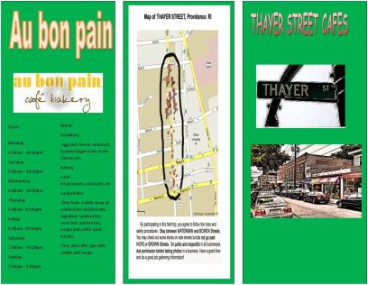
CD COVERS
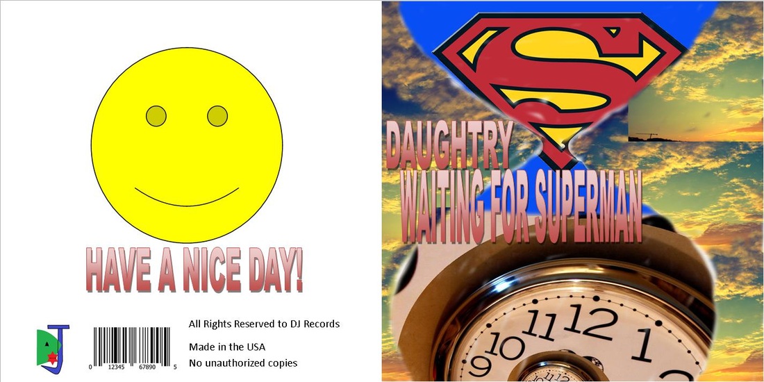
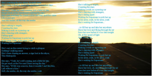
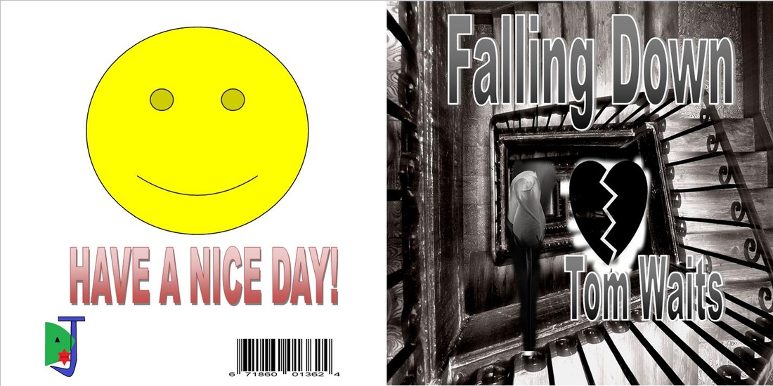
This CD cover project was split into two separate parts. One CD cover we designed was for a song of our personal choosing, the second CD cover was for a song that was assigned to us. The first CD cover I made was using PhotoShop tool the clone stamp tool. I took a picture of the super-man logo and copied it into the hourglass picture i started with. Then, I found a picture of a clock with the time spiraling in on itself and copied that into the second half of the hour glass. Next, I took a photo of a sunset and cloned it in behind the hourglass. Then for the back of the cover we had to design our own record label. I used Microsoft Paint and used my first two initials as my logo as well as a red star placed in the middle. Then we also had to write a copyright information and place a bar-code on the back as well. Finally, we had to print the lyrics on the inside of the cover, which needed a background, I used another photo of a sunset, this time with a car driving into the distance, because during the song the band mentions the women watching the taxi drive away. The song I created this cover for was "Waiting for Superman" by the band Daughtry.
|
|
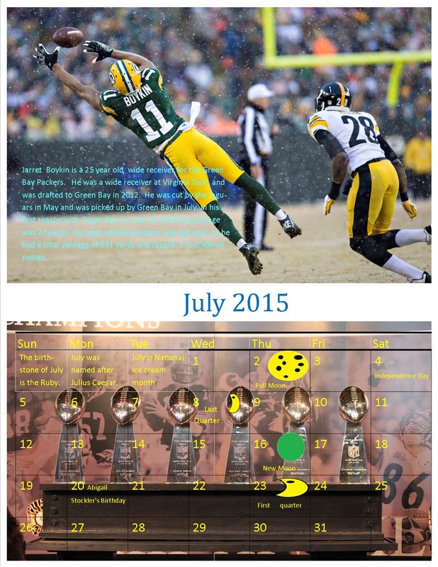
Calendar Project
|
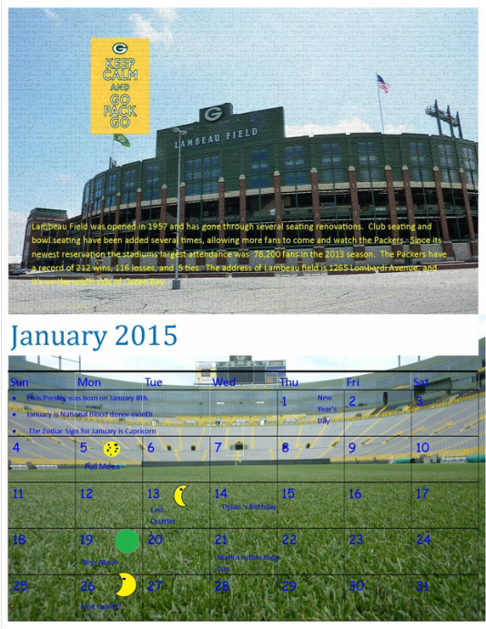
We've begun to do a calendar project using different tools from photoshop, but the images we alter are from our own decisions. In the month of January, we had to use the clone tool in photoshop to add in another image and then filter it to make it seem as the second image had never been cloned in. I used a Packers meme and cloned it into a picture of Lambeau Field. I then filtered the image so it all came together. On the top is a view of the atrium on Lambeau Field and the bottom photo is a field side view of the field. Each month has the moon phases and important events during the month. Also, any empty days are filled in with facts about the month.
|
|
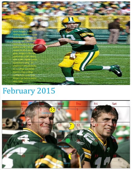
In the month of February we had a free desgin in which we could make our own decsion on how to do the calendar for that month. I took two pictures of Aaron Rodgers and filtered them to make my own. The pciture on the top did come out slightly pixely but it's still easy to read the text on the page.
|
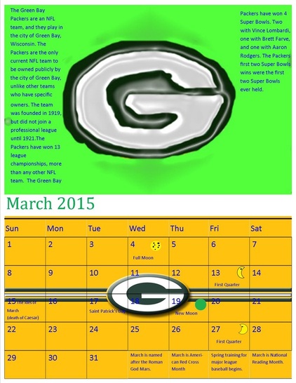
In the month of March we were required to use the brush tools in photoshop to basically draw our own photo. I took a picture of the Green Bay Packers logo and re drew it with the brush tools, then filtered it to get rid of any parts that stuck out, to try and make the picture look like it had never been painted.
|
|
In the month of July we were required to use a free design of the filter galleries in photoshop. I used a picture of Jarrett Boykin, a wide receiver for the Green Bay Packers. I used a sand grain filter and altered the photo so it differed from the original image.
|
