Term 1
Anti Bullying Stickers
|
|
|
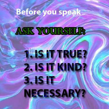
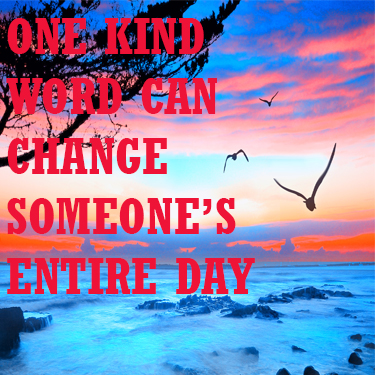
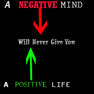
Our first assignment of the year was to create several stickers for the Anti-Bullying Coalition. We were given two phrases and could design the stickers anyway we wanted to. In the first sticker which had to say that "One Kind Word Can Change Someone's Entire Day," I found an aesthetic beach and blurred out the background slightly in Adobe Photoshop. For the second sticker I found a abstract purple background and changed the text style and effects as well as the colors in Adobe Photoshop. For the third sticker I found a motivational phrase for the sticker and then put down a black background and again played with the text effects and even created arrows with the shape tool.
SB LOGO DESIGN
Our second project we were assigned was to re-create the interlocked school logo for the basketball scoring table. We used an image and crated a vector drawing in Adobe Illustrator. I then used the fill tool to color it blue, as well as make a thicker border line and made the color silver. Finally, we rasterized the logo so any vectors disappeared and then I exported it to a JPEG file and sent it to the Athletic director.
Apple
|
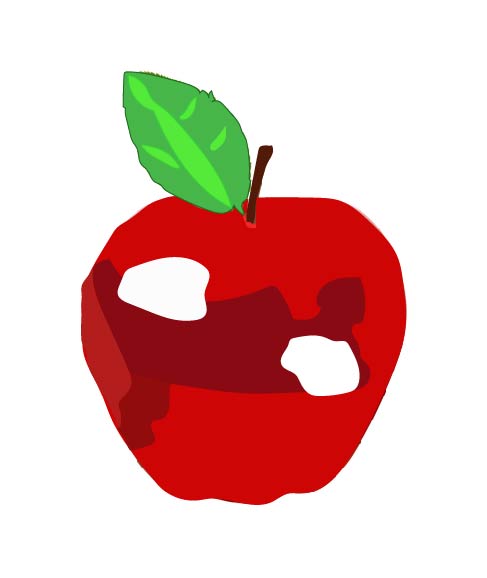
Our first experience with Adobe Illustrator was to try and draw an apple from vector drawings. We found an apple online and drew over it and added things with the pencil tool and changed colors as well. I first added different shades to the apple by changing the fill color on the vector that I had drawn with the pencil tool.
Community Service Logo
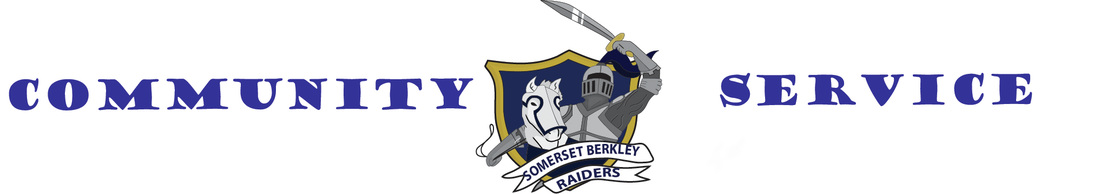
We were asked to create a new community service banner by the guidance department. I decided to user Adobe Illustrator and used the Raider AI file as a focal point for the whole banner. The banner had to be within the measurements of 30 inches wide by 5 inches long. I then decided to use a bold text and just have it say "Community Service" on either side of the raider. We had to print the sheet in two pieces on 11x17 paper.
Marble Letter

|

|
We began using Adobe Illustrator as well to create a marble background of our name. On the left is my finished product with the marble background inside of it, which was used by creating the clipping mask tool and the swatch libraries. I used a red white and blue gradient for the marble background because I felt the marble looked the best with those three colors. On the right is my original gradient letter which was created with the text tool as well as the swatch libraries. I decided to use a rainbow gradient for the original letter, before I put the marble background inside of it.
TERM 2
Google Doodle
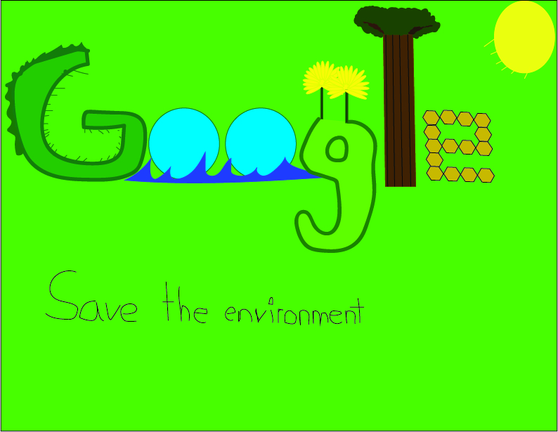
We were assigned to go enter the Google doodle contest. This was a contest in which students are asked to design and create their own Google logo. I decided to do mine based on the theme of the environment and make each letter into some environmental issue. The first G is grass-like because I feel that our land is being destroyed and in order to make way for urbanized society. The two O's represent the ocean and the pollution that is a current problem in the ocean. The second G with the two flowers represent the beauty of nature that is being destroyed do to the modern age and people no longer caring about seeing nature for what it is and not something to be all over social media about. The tree for the L represents the deforestation of many areas across the globe, where trees provide the world oxygen and without them there would be no human existence. The e represents honeycombs which bees produce. Many people do not know how important to the environment bees are and they provide many things that humans need and could not live without.
Thayer Street Map
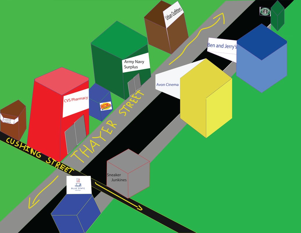
Our second assignment of Term 2 was to create a map of Thayer street of the most important buildings we had noticed on our field trip there. We used Adobe Illustrator to create a geometric map of the important buildings. Some of the most important buildings I noticed were Starbucks, Ben and Jerry's the Avon Cinema and CVS Pharmacy. We had to use tools such as the polygon tool as well as the pen tool to be able to give the buildings a geometric look to it. I created the small doors on some of the buildings using the rectangle and sheer tool in order to make them fit the buildings they were being placed on to.
Knights of Pythias Poster Contest
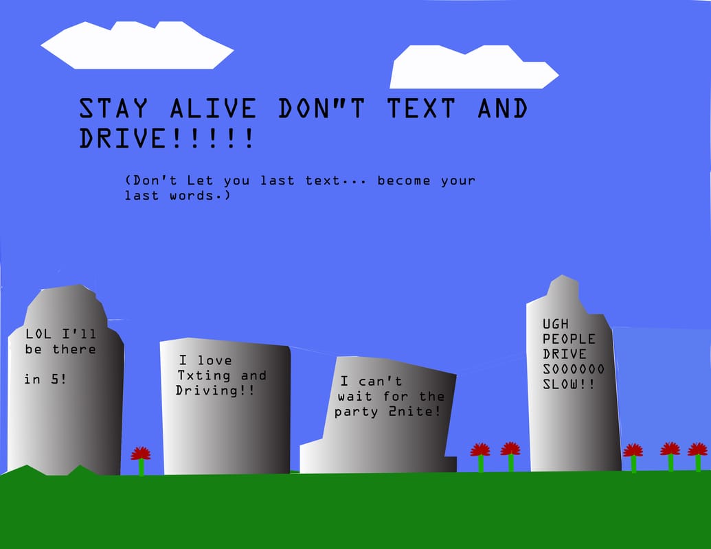
Our next assignment was to design a poster for the Order of the Knights of Pythias poster contest. The theme of the contest was to stray away from distracted driving. I created this in Adobe Illustrator using both the pen tool and different color swatches in order to create the effect of the tombstones. I then created the small flowers in which I proceeded to copy and paste to make replicas of the flowers.
Dunkin' Donuts Safety Scholarship
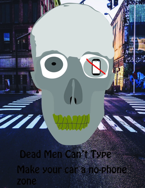
Another assignment we were assigned was to create a safety poster for the Dunkin Donut's 4-Safety poster contest. I again stuck to the idea of texting and driving and actually drew a skull from a picture I found online using the pencil tool and multiple layers. I then designed the teeth and instead of putting to eyes I made a cellphone located in the right eye. I also found a street background in order to show that while driving cellphones should not be a concern to the driver. I then added the text which said, "Dead Men Can't Type, make your car a no-phone zone."
